Can we get the plugin for Vanilla the saves the Quick reply box on reload?
X4B - DDoS Protection: Affordable Anycast DDoS protection including Layer 7 mitigation with PoPs in the Europe, Asia, North and South America.
Latest Offer: Brazil Launch 2020 Offer
@flips said:
Dark theme mobile, minor bug for longer Category names:
I'll look into that, thanks.
@vyas said:
Vanilla shows my timezone for posts as GMT +5 instead of GMT +5.5
Browser: opera/duckduckgo/safari/ firefox
OS: Mac Catalina/ iOs/ android
Theme : either
Thanks
This has been an issue in Vanilla for over 6 years unfortunately. I can sort it but I'd have to go over and create a pull request at Vanilla - so it'll take a while. Here's the issue: https://github.com/vanilla/vanilla/issues/1626
This has been an issue in Vanilla for over 6 years unfortunately. I can sort it but I'd have to go over and create a pull request at Vanilla - so it'll take a while.
Thanks for confirming, I figured it was a Vanilla issue.
@Solaire - quick ask - would it be possible to have a slightly darker (non-white, more grayish) background on the main page for discussions that have no unread posts for logged in users? Something similar to LET, where the background is white only when there's an unread post (and it sort of "highlights" that discussion). It is (to me) much easier on the eye when there's a bold-font as well.
I'm struggling to discern the read-vs-unread discussions on the main page as they're all uniformly listed.
@nullnothere said: @Solaire - quick ask - would it be possible to have a slightly darker (non-white, more grayish) background on the main page for discussions that have no unread posts for logged in users? Something similar to LET, where the background is white only when there's an unread post (and it sort of "highlights" that discussion). It is (to me) much easier on the eye when there's a bold-font as well.
I'm struggling to discern the read-vs-unread discussions on the main page as they're all uniformly listed.
Thanks in advance.
Sure thing . I'm out for the night but I'll try some things tomorrow and report back
The OK and Cancel button captions for adding hyperlinks have the same color as the background. They do change to green on hover. I could not dismiss the dialog after adding the link (neither OK nor Cancel works), had to click outside the dialog to dismiss.
Edit: Even the edit gear wheel has the same color as the background. I thought this new Vanilla does not allow posts to be edited at first. Hard to see below:
@Solaire said: Sure thing . I'm out for the night but I'll try some things tomorrow and report back
That was quick. I can already see things so much better and it is eminently more readable for me. Thank you so much for a really important ergonomic change.
Now if I could just speed up my brain to comprehend things faster...
nullnothere said: That was quick. I can already see things so much better and it is eminently more readable for me. Thank you so much for a really important ergonomic change.
This one goes to @Phill , he beat me to it . It's only working for the default theme though - so I'll have a look at that to make sure it also works on dark / grey.
Please empty / clear your cache. This was sorted days ago
saibal said: The OK and Cancel button captions for adding hyperlinks have the same color as the background. They do change to green on hover. I could not dismiss the dialog after adding the link (neither OK nor Cancel works), had to click outside the dialog to dismiss.
Sorted . Dismissing it still doesn't work by clicking ok / cancel, that's a more long-term thingy.
saibal said: Edit: Even the edit gear wheel has the same color as the background. I thought this new Vanilla does not allow posts to be edited at first. Hard to see below:
Sorted
Francisco said: It'd be nice if we could tab from the textarea for comments right to Post Comment. Right now it links to the Markdown wikipedia.
There is a tabindex on the Post Comment option but I'm afraid it's overridden by the editor. I'm kinda missing ctrl + enter myself but I'll have to look into the editor at some point to fix a few things so while I'm at it I'll take a peek at this
Thanks for the hard work, Design Team! I think the UX improvements since the start has made the forum so much more user-friendly. It's a lot easier to understand the various state of discussions on different platforms! I am really enjoying the UX a lot better than the one on LET. It's like a short-sighted person putting on glasses after years of blurry vision.
Quick nitpick: can the Design Team tag (maybe other roles too as long as they're contributing more than a general member) be in a different color so that it/they stand(s) out?
So nice to look forward to a bunch of small, incremental fixes every few days that just kicks the UX up a notch each time. Getting awesomer and awesomer.
Sorry again if asked already, but on Android Firefox it's kinda weird trying to scroll the home page. I don't really know how to explain it but it's like the individual threads are selected and dragged when I scroll, or a bunch from the bottom of the screen will move but the top few threads will glitch out and overlap.
Could be visual, could just be what newer vanilla is like. It isn't keeping me up at night but if it's a thing I thought I'd say.
Edit: I've also been using the same cache for like a week so I'm going to refresh
@SmallWeb said:
Sorry again if asked already, but on Android Firefox it's kinda weird trying to scroll the home page. I don't really know how to explain it but it's like the individual threads are selected and dragged when I scroll, or a bunch from the bottom of the screen will move but the top few threads will glitch out and overlap.
Could be visual, could just be what newer vanilla is like. It isn't keeping me up at night but if it's a thing I thought I'd say.
Edit: I've also been using the same cache for like a week so I'm going to refresh
@SmallWeb said:
Sorry again if asked already, but on Android Firefox it's kinda weird trying to scroll the home page. I don't really know how to explain it but it's like the individual threads are selected and dragged when I scroll, or a bunch from the bottom of the screen will move but the top few threads will glitch out and overlap.
Could be visual, could just be what newer vanilla is like. It isn't keeping me up at night but if it's a thing I thought I'd say.
Edit: I've also been using the same cache for like a week so I'm going to refresh
screenshot-able issue?
I'll record. I cleared my data and the default light theme had no issues. I'm using the dark mode logged in which is doing it. I'll be back.
Seems I can add tag(s) to a thread/topic by tapping the cog wheel (not sure if that's just for my own experience or seen by all?)
Seems to be an issue with the dark mode, though:
This is why I don't get involved with web design (as much as possible) - nit-picking especially.
(Dark/Night theme: ya brought that on yerself :-p )
In stasis until the shitposting stops/abates.
Than=compare;then=sequence:brought=bring;bought=buy:staffs=pile of sticks:informations/infos=no plural. It wisnae me! A big boy done it and ran away. || NVMe2G for life! until death (the end is nigh).
AlwaysSkint said: This is why I don't get involved with web design (as much as possible) - nit-picking especially.
(Dark/Night theme: ya brought that on yerself :-p )
May I remind you that you almost left the forum because of the lack of dark theme haha.
AnthonySmith said: May I remind you that you almost left the forum because of the lack of dark theme haha.
Ahh, age is catching up with ya, m'lad. 'Twas t'other way about as dark screws up my eyesight. :-p
In stasis until the shitposting stops/abates.
Than=compare;then=sequence:brought=bring;bought=buy:staffs=pile of sticks:informations/infos=no plural. It wisnae me! A big boy done it and ran away. || NVMe2G for life! until death (the end is nigh).
Minor inconsistencies in the dark theme
Exhibit 1: Some fields happen to be white
Exhibit 2: The post divider is clear but I can hardly distinguish the signature divider; also the quoted text could be made more evident I guess
Finally, the "Thanks" button is bigger than the "Flag" one, not sure if bug or feature :

Comments
Can we get the plugin for Vanilla the saves the Quick reply box on reload?
X4B - DDoS Protection: Affordable Anycast DDoS protection including Layer 7 mitigation with PoPs in the Europe, Asia, North and South America.
Latest Offer: Brazil Launch 2020 Offer
I'll look into that, thanks.
This has been an issue in Vanilla for over 6 years unfortunately. I can sort it but I'd have to go over and create a pull request at Vanilla - so it'll take a while. Here's the issue: https://github.com/vanilla/vanilla/issues/1626
Thanks for confirming, I figured it was a Vanilla issue.
blog archives
@Solaire - quick ask - would it be possible to have a slightly darker (non-white, more grayish) background on the main page for discussions that have no unread posts for logged in users? Something similar to LET, where the background is white only when there's an unread post (and it sort of "highlights" that discussion). It is (to me) much easier on the eye when there's a bold-font as well.
I'm struggling to discern the read-vs-unread discussions on the main page as they're all uniformly listed.
Thanks in advance.
Sure thing
. I'm out for the night but I'll try some things tomorrow and report back
On the dark theme code tags make text the same color and is unreadable.
https://i.gyazo.com/b92609d4314fd13d55300f7ae24e5218.png
ExtraVM - KVM NVMe VPS in USA, EU, APAC -|- RackColo - Find Colo
Wow!
Latest theme updates in, please hard refresh.
https://inceptionhosting.com
Please do not use the PM system here for Inception Hosting support issues.
https://i.gyazo.com/d5fea5a5cfe1a2f1c1ecdec8d151d4d8.png
ExtraVM - KVM NVMe VPS in USA, EU, APAC -|- RackColo - Find Colo
Wow!
It'd be nice if we could tab from the textarea for comments right to
Post Comment. Right now it links to the Markdown wikipedia.This is controlled with the
tabindexproperty.Francisco
The OK and Cancel button captions for adding hyperlinks have the same color as the background. They do change to green on hover. I could not dismiss the dialog after adding the link (neither OK nor Cancel works), had to click outside the dialog to dismiss.
Edit: Even the edit gear wheel has the same color as the background. I thought this new Vanilla does not allow posts to be edited at first. Hard to see below:
Dark theme on Chrome 78.x on Debian with uBlock.
That was quick. I can already see things so much better and it is eminently more readable for me. Thank you so much for a really important ergonomic change.
Now if I could just speed up my brain to comprehend things faster...
This one goes to @Phill , he beat me to it
. It's only working for the default theme though - so I'll have a look at that to make sure it also works on dark / grey.
Sorted. Will be included in the next update:
Grey:

Dark:

Change log for the next update. If I missed anything so far, please let me know.
Sorted
Please empty / clear your cache. This was sorted days ago
Sorted
. Dismissing it still doesn't work by clicking ok / cancel, that's a more long-term thingy.
Sorted
There is a tabindex on the Post Comment option but I'm afraid it's overridden by the editor. I'm kinda missing ctrl + enter myself but I'll have to look into the editor at some point to fix a few things so while I'm at it I'll take a peek at this
UPDATES IN - HARD REFRESH!
https://inceptionhosting.com
Please do not use the PM system here for Inception Hosting support issues.
Thanks for the hard work, Design Team! I think the UX improvements since the start has made the forum so much more user-friendly. It's a lot easier to understand the various state of discussions on different platforms! I am really enjoying the UX a lot better than the one on LET. It's like a short-sighted person putting on glasses after years of blurry vision.
Deals and Reviews: LowEndBoxes Review | Avoid dodgy providers with The LEBRE Whitelist | Free hosting (with conditions): Evolution-Host, NanoKVM, FreeMach, ServedEZ | Get expert copyediting and copywriting help at The Write Flow
Hear Hear!
Thanks Solaire for the updates

And phill too
Quick nitpick: can the Design Team tag (maybe other roles too as long as they're contributing more than a general member) be in a different color so that it/they stand(s) out?
and @phill
https://inceptionhosting.com
Please do not use the PM system here for Inception Hosting support issues.
Latest theme updates in, I have incremented the theme version which should force everyone's cache to update for them but just in case
hard refresh!
Thanks for the updates @Solaire @Phill
https://inceptionhosting.com
Please do not use the PM system here for Inception Hosting support issues.
So nice to look forward to a bunch of small, incremental fixes every few days that just kicks the UX up a notch each time. Getting awesomer and awesomer.
Deals and Reviews: LowEndBoxes Review | Avoid dodgy providers with The LEBRE Whitelist | Free hosting (with conditions): Evolution-Host, NanoKVM, FreeMach, ServedEZ | Get expert copyediting and copywriting help at The Write Flow
I like the new tags. Great work folks!
Sorry again if asked already, but on Android Firefox it's kinda weird trying to scroll the home page. I don't really know how to explain it but it's like the individual threads are selected and dragged when I scroll, or a bunch from the bottom of the screen will move but the top few threads will glitch out and overlap.
Could be visual, could just be what newer vanilla is like. It isn't keeping me up at night but if it's a thing I thought I'd say.
Edit: I've also been using the same cache for like a week so I'm going to refresh
Michael from DragonWebHost & OnePoundEmail
screenshot-able issue?
https://inceptionhosting.com
Please do not use the PM system here for Inception Hosting support issues.
I'll record. I cleared my data and the default light theme had no issues. I'm using the dark mode logged in which is doing it. I'll be back.
Michael from DragonWebHost & OnePoundEmail
@SmallWeb urgh... that one is for @Solaire or @phill I have no diea why that is happening.
https://inceptionhosting.com
Please do not use the PM system here for Inception Hosting support issues.
@SmallWeb odd - I'm not seeing that on Android 9 with the latest Firefox. Which versions are you using?
Yay! We have colored tags now. Awesome stuff Solaire, Phill and the design team
That’s some Voodoo sh*t going on there! Hmm
Loading speed in my iPhone is slow compare to Web browsers.
Seems I can add tag(s) to a thread/topic by tapping the cog wheel (not sure if that's just for my own experience or seen by all?)
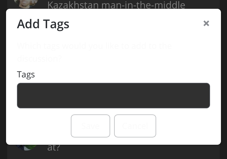
Seems to be an issue with the dark mode, though:
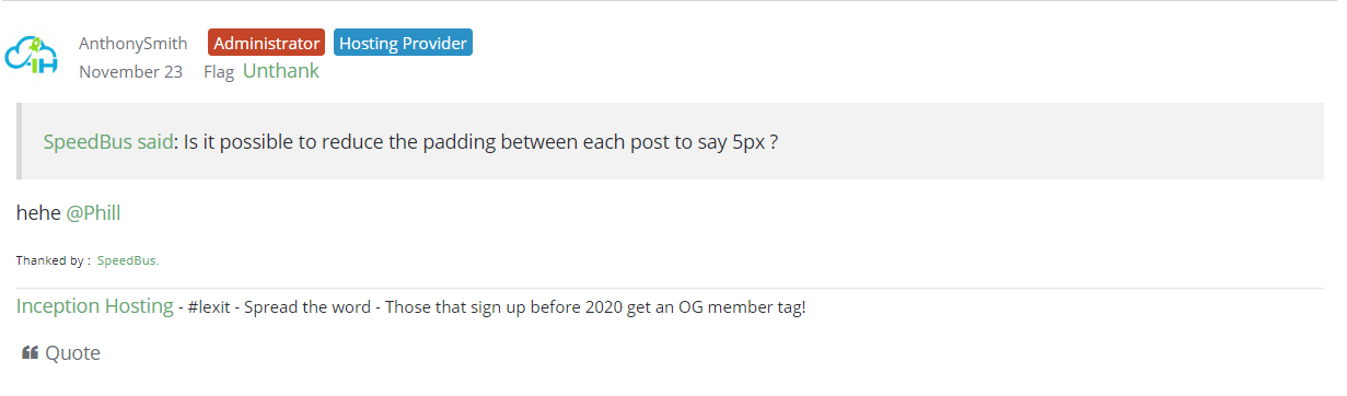
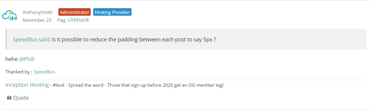
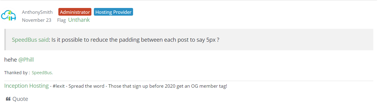
Is it possible to reduce the padding between each post to say 5px ?
.DataList .Item, .MessageList .Item { padding: 5px!important; }For example,
10px -->
5px -->
or say if the padding remains at 10px, is it possible to add a hover (highlight/grey tint) on mouse-over ?
CrownCloud - Internet Services | Los Angeles, California | Frankfurt, Germany | Amsterdam, The Netherlands | Atlanta, Georgia | Miami, Florida
hehe @Phill
https://inceptionhosting.com
Please do not use the PM system here for Inception Hosting support issues.
Oh just noticed the "Thanked by" text size,
CrownCloud - Internet Services | Los Angeles, California | Frankfurt, Germany | Amsterdam, The Netherlands | Atlanta, Georgia | Miami, Florida
To big?
https://inceptionhosting.com
Please do not use the PM system here for Inception Hosting support issues.
This is why I don't get involved with web design (as much as possible) - nit-picking especially.
(Dark/Night theme: ya brought that on yerself :-p )
In stasis until the shitposting stops/abates.
Than=compare;then=sequence:brought=bring;bought=buy:staffs=pile of sticks:informations/infos=no plural.
It wisnae me! A big boy done it and ran away. || NVMe2G for life! until death (the end is nigh).
May I remind you that you almost left the forum because of the lack of dark theme haha.
https://inceptionhosting.com
Please do not use the PM system here for Inception Hosting support issues.
Ahh, age is catching up with ya, m'lad. 'Twas t'other way about as dark screws up my eyesight. :-p
In stasis until the shitposting stops/abates.
Than=compare;then=sequence:brought=bring;bought=buy:staffs=pile of sticks:informations/infos=no plural.
It wisnae me! A big boy done it and ran away. || NVMe2G for life! until death (the end is nigh).
Caught up with me a while ago
https://inceptionhosting.com
Please do not use the PM system here for Inception Hosting support issues.
hahah, can it be a bit bigger please :P
CrownCloud - Internet Services | Los Angeles, California | Frankfurt, Germany | Amsterdam, The Netherlands | Atlanta, Georgia | Miami, Florida
better?
https://inceptionhosting.com
Please do not use the PM system here for Inception Hosting support issues.
I think 80-85% font size seems better?
div.ThankedByBox>* { font-size: 85%!important; line-height: 70%; }Currently,

85%,

80%,

CrownCloud - Internet Services | Los Angeles, California | Frankfurt, Germany | Amsterdam, The Netherlands | Atlanta, Georgia | Miami, Florida
Ok done.
https://inceptionhosting.com
Please do not use the PM system here for Inception Hosting support issues.
Minor inconsistencies in the dark theme
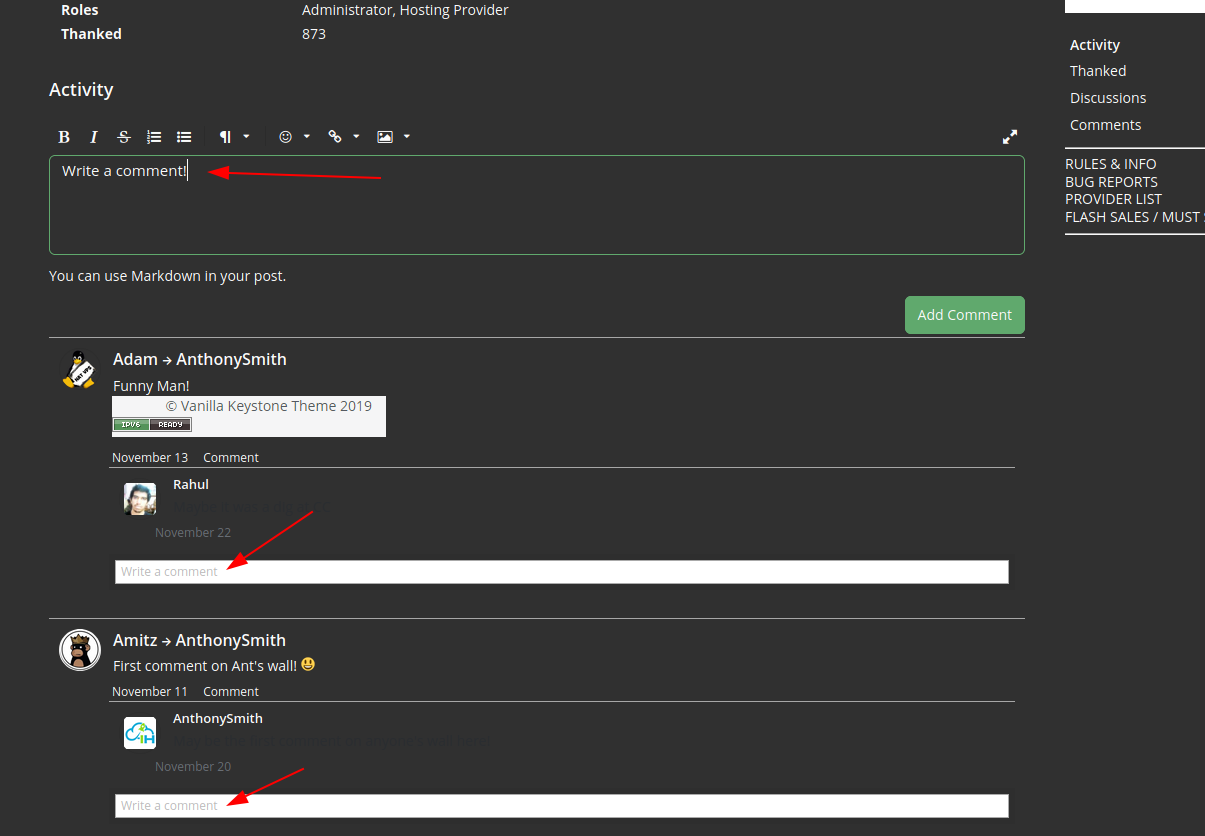
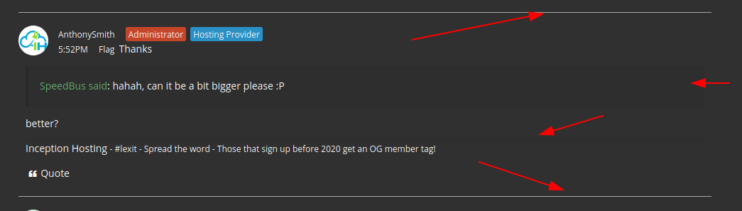
:
Exhibit 1: Some fields happen to be white
Exhibit 2: The post divider is clear but I can hardly distinguish the signature divider; also the quoted text could be made more evident I guess
Finally, the "Thanks" button is bigger than the "Flag" one, not sure if bug or feature
Thank you! Looks much better now!
CrownCloud - Internet Services | Los Angeles, California | Frankfurt, Germany | Amsterdam, The Netherlands | Atlanta, Georgia | Miami, Florida
HARD REFRESH! latest fixes in.
https://inceptionhosting.com
Please do not use the PM system here for Inception Hosting support issues.
Don't know if this is a bug or not, but I have no notification telling me that @AnthonySmith quoted post 4332 in post 4334.
Not a bug, that is a feature.
https://inceptionhosting.com
Please do not use the PM system here for Inception Hosting support issues.
That's ok then. This one notified me ok.